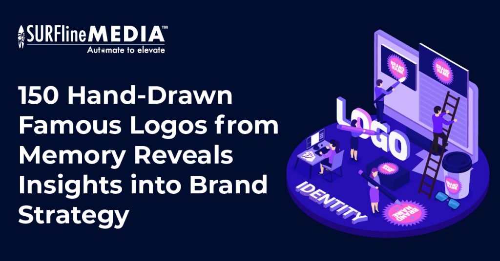
Logo design is an essential aspect of branding strategy, often defining a company’s identity in the eyes of consumers. To gauge the memorability of iconic logos, Signs.com conducted a captivating experiment involving 156 participants tasked with recreating 11 famous logos entirely from memory.
In our recent exploration, we will analyze the experiment from Signs.com. The results uncovered intriguing trends and highlighted the intricate relationship between design and memory, shedding light on the art and science of brand strategy.
1. The Experiment of Signs.com reveals insights into Brand Strategy
The testament from Signs.com is a unique experiment that delves into the fascinating world of human memory and its interaction with iconic brand logos. In this study, more than 150 individuals were asked to recreate famous logos purely from memory, without any visual reference.
Over the course of 80 hours, participants sketched logos of well-known brands such as Apple, Adidas, Starbucks, and more. The testament reveals intriguing insights into how our minds perceive and remember these symbols that have become integral to our daily lives.
Through the testament, we gain valuable insights into the complexities of logo design and brand recognition. It sheds light on the accuracy of our memory when it comes to intricate details, shapes, and colors within these logos. The experiment’s findings have broader implications for the field of design marketing, emphasizing the importance of simplicity, consistency, and memorable elements in logo creation to ensure strong brand strategy.
2. Apple’s Logo Analysis
2.1 The evolution of Apple‘s logo
With approximately 600 million people worldwide carrying Apple devices in their pockets, on their wrists, or in their possession, the ubiquity of the Apple logo is undeniable. One might assume that recalling this elegantly simple emblem would be effortless, especially considering that its design hints at its own identity, unlike logos such as Starbucks or Foot Locker.

The modern Apple logo, designed in 1977 by Regis McKenna’s ad agency, marked a significant evolution. Art director Rob Janoff aimed for a business-like image, departing from the original depiction of Isaac Newton under an apple tree. Steve Jobs emphasized avoiding cuteness, and the iconic bite was added to convey scale and prevent confusion with a cherry.
2.2 The results of testament on Apple’s logo

- Accuracy: Only 20% of participants managed to accurately recreate Apple’s logo, combining all essential elements correctly.
- Common Mistake: Approximately 33% of individuals mistakenly added a stalk to the logo, even though it doesn’t exist in the actual design. Instead, the logo features a leaf.
- Bite Placement: While 84% of participants correctly remembered the iconic bite, over 20% placed it on the left side instead of the right. This is intriguing considering a similar experiment on Lincoln’s penny showed a higher error rate (50%) in recalling the direction in which Lincoln faced.
- Nostalgic Rainbow Stripes: A small but notable 3% of participants recreated the logo with rainbow stripes, reminiscent of its appearance between 1977 and 1998.
- Color Accuracy: Six percent of participants chose to color the logo red, possibly associating it with a typical red apple. In contrast, a substantial 72% correctly identified it as black or gray, reflecting the actual colors of the logo.
3. Adidas’s Logo Analysis
3.1 The evolution of Adidas‘s logo
Adidas, the global sportswear giant, acquired its iconic three-stripes logo from Karhu Sports in 1952, a symbolic move that has persisted for over six decades. The logo has become synonymous with professional athletes and millions of consumers worldwide.
In 1971, Adidas introduced its distinctive trefoil logo, featuring three leaves representing the continents of the Americas, Europe, Africa, and Asia, united by three lines symbolizing diversity. This enduring emblem continues to grace Adidas’ products, notably the Adidas Originals line.

3.2 The results of testament on Adidas’s logo
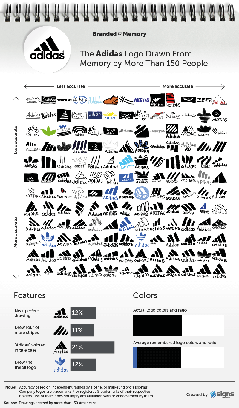
- Accuracy: Only 12% of participants in the study could create near-perfect renditions of the Adidas logo from memory. This involved accurately recalling the logo’s key attributes: three stripes (not four or more), the lowercase spelling of “adidas” (as opposed to a capital “A”), and the absence of a brown boot, which was a misconception by one participant.
- Trefoil Representation: Approximately 10% of participants drew the Adidas trefoil logo, introduced in 1971. This emblem features three leaves representing the continents of the Americas, Europe, Africa, and Asia, connected by three lines symbolizing diversity. The trefoil logo is still utilized, especially in the Adidas Originals line.
- Color Variations: Interestingly, 8% of participants incorporated the color blue into their drawings, despite black being the Adidas logo’s primary color. This discrepancy may relate to the extensive use of blue in Adidas packaging, notably on their blue footwear boxes.
4. Burger King’s Logo Analysis
4.1 The evolution of Burger King‘s logo
Unlike the minimalistic Apple and Adidas logos, Burger King‘s emblem is more intricate, comprising three elements (text, bun halves, and a crescent shape) and three colors (red, yellow, and blue). Surprisingly, the added complexity and colors didn’t significantly affect participants’ ability to recall it accurately. Burger King had a good brand strategy throughout history.

4.2 The results of testament on Burger King’s logo

- Accuracy Comparison: 18% of participants could recall Burger King’s logo almost perfectly, slightly surpassing Apple at 20% and surpassing Adidas at 12%.
- Crown Confusion: Notably, 21% of participants included a crown in their drawings, even though Burger King’s logo hasn’t featured one since the “sitting king” logo used from 1957 to 1969. This suggests a tendency to blend elements from broader advertising campaigns with the logo itself.
- Logo Nostalgia: Participants, with an average age of 34, surprisingly recalled the defunct Burger King logo from 48 years ago, which was in use from 1969 to 1999. This could be attributed to difficulty in accurately remembering the current logo, prompting them to include a crown associated with the brand’s name, the King character from ads, and the paper crowns given out in restaurants. Some individuals may have also attempted to draw the current logo but omitted key features.
5. Domino’s Logo Analysis
5.1 The evolution of Domino‘s logo
The original Domino’s Pizza logo in the 1960s showcased three dots, symbolizing the first three stores owned by founders Tom and James Monaghan. Although the initial plan was to add a dot for each new store, rapid expansion rendered this impractical, resulting in the retention of the original three dots.

5.2 The results of testament on Domino’s logo

- Dots Accuracy: 28% of participants correctly recalled that the Domino’s logo featured three dots, positioned correctly (two in the bottom square, one in the top). However, 37% included more than three dots, while 14% omitted them entirely.
- Overall Accuracy: In total, 16% of drawings closely resembled the Domino’s logo, with 28% making good attempts, featuring minor mistakes but maintaining a strong resemblance.
- Logo Versions: Surprisingly, 14% of participants drew the older square Domino’s logo used between 1996 and 2012, while 15% unmistakably depicted this older version. Additionally, the remembered shade of blue in drawings closely resembled the royal blue of the older logo compared to the current sky blue.
- Brand Name Inclusion: Two-thirds of participants included the brand name in their drawings, with 55% forgetting the apostrophe and 11% adding an “e” (Dominoe’s) inaccurately. This shows a good brand strategy.
6. 7-Eleven’s Logo Analysis
6.1 The evolution of 7-Eleven‘s logo
The 7-Eleven logo, established in 1946, has remained relatively unchanged. It features a numeral seven intersected by “Eleven” within a white trapezoid against a green backdrop. The sole significant alteration occurred in 1969 when the upper part of the “7” turned orange, while the bottom remained red.

6.2 The results of testament on 7-Eleven’s logo
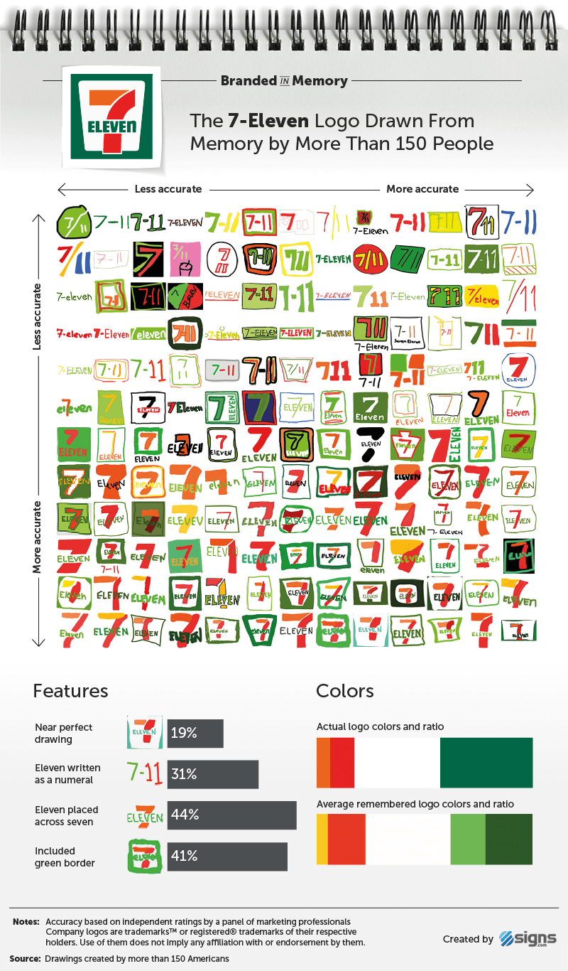
- Accuracy Levels: Only 19 percent of participants were able to create near-perfect renditions of the 7-Eleven logo, while 46 percent produced logos closely resembling the actual design but with minor discrepancies.
- Common Errors: The study revealed common errors made by participants, with 31 percent mistakenly writing “Eleven” as a numeral and 56 percent incorrectly positioning the word “Eleven” beneath the “7” instead of aligning it across the middle.
- Subtle Detail: Surprisingly, only 1 percent of respondents accurately recalled the subtle detail that “eleven” should be written as “ELEVEn” in uppercase letters, with the exception of the letter “n.”
- Complex Memorability: Despite its simple design and decades of unchanged branding, the 7-Eleven logo proved challenging for participants to remember accurately. This underscores the importance of logo consistency and memorability in an effective branding strategy.
7. Foot Locker’s Logo Analysis
7.1 The evolution of Foot Locker‘s logo
The Foot Locker logo, featuring a referee with hands on hips facing right, accompanied by “Foot Locker” in red text underneath, has been in use since 1988. Although the logo isn’t consistently displayed on storefronts of their 3,300+ global stores, it can be found on their shopping bags.
This experiment showed that logos with human figures, like Foot Locker’s referee, are among the least accurately recalled, suggesting that incorporating people in logos adds complexity that makes them harder for people to remember. Starbucks, another logo with a human figure, had a similar issue with memorability in the study.
7.2 The results of testament on Foot Locker‘s logo

- Referee Figure Inclusion: 57 percent of participants included the referee figure in their drawings of the Foot Locker logo, with 60 percent correctly portraying him facing in the correct direction and 50 percent remembering his hands on his hips.
- Logo Accuracy: Only 8 percent of participants drew a near-perfect Foot Locker logo from memory, making it the second least accurately remembered logo among the 10 tested.
- Common Mistakes: Common mistakes included adding a baseball hat to the referee (18 percent), drawing a striped referee’s shirt without the figure (9.7 percent), and including a literal shoe or foot (14 percent) in their renditions, demonstrating various ways people inaccurately recalled the logo.
8. Starbucks’s Logo Analysis
8.1 The evolution of Starbucks’s logo
Starbucks has featured three logos since its establishment in 1971, all depicting a twin-tailed mermaid, or siren, from Greek mythology. The original logo depicted a topless mermaid, but in 1987, it was redesigned with flowing hair to cover her breasts and a change from brown to green as the primary color.

8.2 The results of testament on Starbucks’s logo

- Simplified Logo: Starbucks’ current logo, simplified in 2011, no longer includes “Starbucks Coffee” text and is entirely green, yet only 6 percent recreated it accurately from memory.
- Mermaid Recognition: The Starbucks mermaid is highly recognizable (90 percent included her), but details like her crown were often forgotten (56 percent).
- Previous Logo: Thirty-one percent remembered the previous Starbucks logo, which included the brand name and a black circle.
- Logo Recall: Despite Starbucks’ immense popularity, its logo, with intricate details, was the least accurately recalled among the brands examined.
9. Walmart’s Logo Analysis
9.1 The evolution of Walmart’s logo
Walmart‘s logo history reflects its growth from a small retail store to a global giant. It started with plain sans-serif lettering in the 1960s, transitioned to a Wild West-inspired “Frontier Font,” and eventually simplified to plain lettering in 1981, though some still remember it with a hyphen.
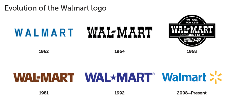
9.2 The results of testament on Walmart’s logo

- Hyphen Era Remembrance: During Walmart’s early years (1962-1981), the logo featured a hyphen between “Wal” and “Mart.” Surprisingly, only 7 percent of participants included this somewhat archaic detail in their recollections. This reflects a disconnect between the historical logo and modern perceptions.
- Sunburst Symbol: Walmart introduced a sunburst symbol in 2008 to make its logo friendlier and more inviting. Impressively, 68 percent of respondents remembered the sunburst. However, 42 percent of these individuals couldn’t quite replicate the correct sunburst design with six points arranged properly. This suggests that while people recalled its presence, its precise configuration was often a challenge.
- Near Perfect Recollection: Only 12 percent of participants managed to draw a near perfect Walmart logo from memory. This level of accuracy places Walmart in the middle of the pack compared to other logos, such as 7-Eleven (19 percent) and Adidas.
- Complexity of the Sunburst: Despite its overall simplicity in terms of color and text, the sunburst symbol posed a unique challenge in recall. Many participants confused its details, often mixing up elements from old and new logo versions.
10. Target’s Logo Analysis
10.1 The evolution of Target’s logo
Target, a major mass-merchandise retailer, boasts one of the nation’s most iconic logos. A 2003 study revealed that an impressive 96 percent of North Americans instantly linked the retailer to its striking red bull’s-eye symbol, underlining its remarkable recognition and memorability.

10.2 The results of testament on Target’s logo

Accuracy of Target Logo Recall:
- 25% of participants drew near perfect Target logos from memory, ranking it as the second best remembered logo.
- 52% were able to draw it well, closely matching the actual logo with minor flaws.
Ring Count Confusion:
- 41% of participants incorrectly drew the wrong number of circles in the logo.
- 59% correctly represented the logo with a solid center circle and one surrounding ring.
Inclusion of Brand Name:
- 59% of participants chose to include the word “Target” in their drawings, commonly seen on storefronts. However, this wasn’t necessary as Target has often decoupled its name from the logo in advertising since 2006 due to strong brand recognition.
11. IKEA’s Logo Analysis
11.1 The evolution of IKEA’s logo
IKEA, the Swedish furniture giant, boasts the most accurately drawn logo from memory among 156 American participants in our study.

11.2 The results of testament on IKEA’s logo

- Accuracy: Thirty percent of participants accurately recreated the IKEA logo from memory, surpassing Target (25 percent) and Apple (20 percent).
- Case Sensitivity: Fourteen percent of participants forgot that the brand name should be written in all uppercase letters.
- Yellow Oval: Forty-one percent of drawings included the yellow oval behind the brand name, which is commonly associated with IKEA’s printed materials and commercials.
Insights into Design Marketing and Brand Strategy from Logo Recall
The testament on 11 iconic brands’ logos reveals several valuable insights about design marketing and brand marketing strategy, particularly in the context of logo recognition and recall:
- Simplicity is Key: Logos that are simple in design and have fewer intricate details are more likely to be accurately remembered. Brands like IKEA and Target, with minimalist logos, achieved higher recall accuracy compared to logos with complex elements.
- Consistency Matters: Brands that have maintained relatively consistent logos over the years, such as Apple and Starbucks, tend to have better logo recognition. Consistency builds brand familiarity, making it easier for consumers to recall the logo.
- Iconic Symbols: Incorporating iconic symbols or elements in a logo can aid in recognition. For instance, Apple’s distinctive bite mark and Starbucks’ twin-tailed mermaid are memorable and help consumers recall the logos.
- Typography and Color: Typography and color choices play a crucial role in logo design. Recognizable fonts and consistent color schemes enhance brand recall. Inconsistencies in typography, as seen in Walmart’s logo, can lead to confusion.
- Association with Brand Name: While some logos are closely associated with their brand names, others can stand alone without text. This association depends on the brand strategy and the level of brand recognition achieved over time.
- Age and Logo Evolution: The age of participants in logo recall experiments can influence results. People may remember logos that were prevalent during their youth, even if they’ve since evolved.
- Complexity and Figures: Logos with complex designs or figures, like those featuring people (e.g., Foot Locker and Starbucks), may be more challenging for consumers to recall accurately. Simple, iconic shapes tend to perform better in recall tests.
- Brand Familiarity: Brands with a strong market presence and widespread familiarity tend to fare better in logo recall tests. This highlights the importance of continuous marketing efforts, brand visibility and brand strategy.
- Cultural and Regional Factors: Logo recognition can be influenced by cultural and regional factors. Brands should consider local preferences and adapt their logos if necessary for global markets.
Conclusion
The hand-drawn logo experiment of Signs.com offered a fascinating glimpse into the world of marketing design and human perception. It showcased that while some logos are etched into our collective memory, others remain elusive. These insights underscore the importance of simplicity, clarity, and consistency in logo design, essential elements for ensuring that your brand leaves a lasting impression.
At Surfline Media, we not only understand these principles but are committed to crafting logos that resonate with your audience, ensuring a strong brand strategy. We are confident with our top brand strategy services. Book our logo design service today, and let us help you create a visual identity that stands the test of time.
_______________________
![]()
Surfline Media – Automate to Elevate
Our website: https://surflinemedia.com/
Contact us: https://surflinemedia.com/contact-us/
Phone number: +1 323-741-4482
Email: [email protected]